Saturday, April 25, 2020

Lab 9 Using Arc Collector

Introduction-

Lab 9 was a centered around data collection with a mobile device. The ArcGIS Collector app, for iPhone, was used to collect this data, and ArcGIS Online was used to create the map. ArcGIS Collector is used to collect mobile data without a UAS. The data collected is on a predesigned map from ArcGIS Online, with the specific layers and points desired to be mapped. ArcGIS Collector relates to UAS by the collection of data for mapping. Although UAS data collection is more dynamic and accurate, the mobile app still allows you to map an area and its features.

Methods-

To start the lab, once the app was installed, a tutorial on ArcGIS's Collector details the basics the app can deliver. The tutorial has the reader try the free version of the mobile app, and using the Parks template provided. The template already has the layers and feature designations preset, so the tutorial requires no preparation. The task of this tutorial is to go to a park and find a picnic table to map the tables location, then take a picture of it. Once the picnic table's position is defined, the next and final step is to stream map the closest path to the picnic table. I preformed the tutorial in the park in Bloomfield, IN. Figure 1 represent the picnic table location, figure 2 and 3 represent the streaming and finalized path to the picnic table.

Figure 1: Picnic table location
Figure 2: Streaming picnic table path

Figure 3: Mapped path
 After the finishing the tutorial, the lab continues diving into the app by having the user signing in and completing another tutorial. When signed into the Collector app there are no maps provided, so the user has to create one on ArcGIS Online. When signed into the website, the tutorial has the user prepare the map by building and defining layers for the soon to be created map. The defining features of the map include: picnic tables, restrooms, and water fountains. Once all of the details are finished, the map has to be created and shared with your account for mobile data collection. Then the tutorial has the reader go back to the park and map the picnic tables, restrooms, and water fountains. I went back to the Bloomfield park, and finished mapping it. The following figures represent the finalized mapping of the park, and some of the features for which the area was surveyed.

Figure 4: Bloomfield Park map

Figure 5: Water fountain example

Figure 6: Bathroom example

Figure 7: Picnic table example
Discussion:

This lab showed me that there are more ways of quickly surveying and mapping an area's surroundings. Although the app does not collect as much data as UAS, the app can be used to map features in the mission planning process. The data I collected was limited, due to the park being small, but having data like this for mission planning will allow operators to have a map of the surveying area to avoid. This could be because of large trees, densely populated areas and telephone poles that could be a physical risks or EMI risks. The URL below provides a link to the map I created.
https://purdueuniversity.maps.arcgis.com/home/item.html?id=efdbe26314e54a47b5902eb473c8c29c#overview

Sunday, April 12, 2020

Lab 8: Calculate Impervious Surfaces from Spectral Imagery

Introduction-

This weeks lab consisted of following an online lesson, Calculate Impervious Surfaces from Spectral Imagery, from Learn ArcGIS Online Lesson Gallery. The lesson consists of three sections: Segment the imagery, Classify the imagery and Calculate impervious surface area, but the first two sections were the only assigned portions of the lesson. The goal of the lesson is to understand the process of how to take UAS data and be able to identify and calculate the surface area of impervious areas.

Segment the imagery-

Before we can classify the impervious and pervious areas, once the data is downloaded, we have to change the bands combination to allow the features to clearly show. This step was done with the Extract bands tool in the raster function pane. Extract bands tool makes a new image that uses different colors to display the difference between the pervious and impervious areas in the map, shown in figure 1.
Figure 1: Extracted bands
Next the Classification Wizard was used for image segmentation and classification. Segmentation of the image was to group some of the same looking pixels together to generalize the image, making it easier to classify. There are three parameters of the Classification Wizard to control the segmentation of the map: spectral detail, minimum segment size in pixels and show segment lines only. Changing these three from default values to the given values, defines the important parts to easier distinguish between pervious and impervious areas. The final segmented map should look like figure 2.
Figure 2: Segmented classification


Classify the imagery

After getting segmenting for easier classification, the second section begins by creating training samples. Training samples are polygons created in general areas of either pervious and impervious areas to distinguish the difference, and categorize what each color represents. So two training samples were created to classify pervious versus impervious areas, and given their own distinct color. Then subclasses were made within each training sample to classify the what the exact area represents, like for impervious there are gray roofs, driveways and roads, whereas pervious has bare earth, grass, water and shadows. These samples will later be used to distinguish what area each pixel represents. 

The next step finally classifies the image, representing pervious versus impervious. After clicking run the map should change colors representing the areas classified as pervious or impervious like figure 3.
Figure 3: Classified areas
After running the classification, it is important to reclassify small errors within the map. So for the final page of the wizard the Reclassification page allows you to find these mistakes and correct them. My run did not experience any errors in the preview. Then finally the final classification is to be ran for the final map. After selecting finish the final map should look like figure 4, with green representing pervious areas and grey areas.
Figure 4: Pervious versus Impervious areas

Friday, April 3, 2020

Lab 7: Volumetrics

Introduction:

In this two part lab assignment, the first job was to create a DSM in Pix 4D and find the volume values within an isolated area. In part two, the job was to make an elevation progression map between three sets of raster data of an isolated hill in Litchfield, WI.

Part 1:

In part one of this project ArcGIS Pro was used to isolate a portion of the Wolf Creek data set, and determine the volumetrics (Figure 1-2). The Volume tool was used to outline the desired survey area. Within this area we can determine the terrain's 3D volume, cut volume, fill volume, and total volume (Figure 3). After the volume values are found, ArcGIS Pro was used to map the survey area along with calculating the area's elevations. The tools used to accomplish this part's goal were: Cookie Cutter to extract the desired area to calculate the raster data set, clip to create the polygon, Extract by Mask was used to extract the polygon to separate this from the original raster data set, and Surface Volume for to determine the area's volume and area (Figure 4-5). Then of course the area has to mapped to display the survey area, along with a comparison between the survey area and the original raster set.
Figure 1: Pix4D custom average output
Figure 2: Pix4D volume area

Figure 3: Pix4D default volume
Figure 4: Arc Pro volume part 1
Figure 5: Arc Pro average elevation

Figure 6
Figure 7

Part 2:

Part two's focus was on the new Litchfield data set. The data included three different raster data sets representing three consecutive months of the area. After inputting the data, they all needed to be resampled to get the same pixel size. for all three. The Resampling tool changes the spatial resolution of the raster data. This was used to increase the accuracy of the comparison by changing the three raster datas to 10cm pixel size. Surface volume was then found for each raster data set, Figure 6 represents the comparison over time. Cut Fill was then used to visually compare the surface volume of the three raster sets, represented in Figure 7. Mapping of the area's three rasters was created in a side by side represented in Figure 8.


July
August
September
Coordinate System
WGS 1984 UTM Zone 15N
Pixel Size
10cm
10cm
10cm
Minimum/Maximum Height
226.286m
254.15m
218.943m
271.194m
221.116m
267.257m
Figure 6

Figure 7
Figure 8


Sunday, March 1, 2020

Lab 6: Processing Data in Pix4D with GCPs


Introduction-
Lab 6 was focused on the importance of ground control points (GCPs) in digital mapping by remaking lab 5, which had no GCPs, and comparing the difference in accuracy. GCPs are physical points on the area's surface that provide more accurate elevation and photo positioning data. This is important for quality because if GCPs are not used, like in Lab 5, the data collected will still make a DSM, but will not have accurate elevation values. Recording the correct elevation values is important for surveying and designing projects. If elevation is not important for the project, then GCPs are not needed. Check points can be used for this application as well, but not recommended compared to GCPs. This is due to check points will show errors found, but will not adjust to the correct geospatial points required for the most accurate mapping like the capability of GCPs. Figure 1 shows the locations of the GCPs relative to the flight path and data collection points. 

Figure 1: Initial Image Positions/ GCP locations
Methods-
The data used in this lab was provided with GCPs and processed in Pix4D to create the DSM. After opening the software, the images provided are to be loaded into the project. Then GCPs are to be added in the GCP/MTP Manager function in the correct fashion being the Y, X, Z coordinate order. After the initial processing, a quality report is provided to display any error found in the project, shown in figure 2. In my processing one image was not used due to a corruption of the photo, shown in figure 3. The GCPs were not correctly aligned with the data collection points, so they needed to be fixed. This portion is a great example as to of why it is important to have accurate and detailed field notes. In this particular case orange arrows were used as GCPs, but exactly where the point is supposed to be was not specified. The correct alignment is at the rear of the point of the orange arrow, and the geolocations of the GCPs are presented in figure 4. Once correctly aligned, the final two process were conducted and produced a final quality report. 

Figure 2: Initial Processing Details
Figure 3: Calibration Details
Figure 4: Geolocation Details
Figure 5: Quality Report

Discussion-
Once finished with Pix4D, the project has to be transferred to ArcGIS Pro for final mapping. This project shows great detail of chosen GCPs ], along with another enhanced point near the factory to display the details. The difference between this project and lab 5's project were the use of GCPs. A more concentrated area of the data used in lab 6 was used in lab 5, but the value differences are still relevant. Figure 6 shows the details of the project using GCPs and figure 7 displays lab 5's final map. This comparison is to show how much more accurate the data is using GCPs. 


Figure 6: Lab 6 Map
Figure 7: Lab 5 Map
Conclusion-
Developing projects with and without GCPs has shown me that the use of GCPs is accurate and detailed, but can take much more time developing a DSM than without. So the use of GCPs is circumstantial depending on what the final product needs to include. If elevation and very detailed mapping is needed then GCPs are needed, but if a good visual map is needed then not using them will be faster and easier. 

Sunday, February 23, 2020

Lab 5: Getting Started with Living Atlas

Lab 5: Learn ArcGIS.Com

Introduction

Utilizing work shared within ArcGIS, which had been created by other people, to demonstrate a new trend, was the lab's purpose this week. To start, a tutorial on how to use the Living Atlas function within ArcGIS was completed to expose its helpful capabilities. Five other interesting lessons, only used in ArcGIS Pro, were analyzed, and given a brief description within this weeks report. After the tutorial was finished and the lessons were reviewed, a new project was created solely using the Living Atlas function.

Get Started with ArcGIS Living Atlas of the World

Get Started with ArcGIS Living Atlas of the World is a 45 minute lesson designed to teach the reader how to "access Living Atlas content across the platform and discover the capabilities that these layers and maps can support." This lesson demonstrates in multiple tutorials how to utilize the Living Atlas feature in ArcGIS Pro. The lesson plan is split into 3 sections: explore the Living Atlas website, use Living Atlas online by adding to a web map to customize, and use Living Atlas in ArcGIS Pro to learn how the function can be used on future projects.

This lesson was assigned to further my understanding of how to use ArcGIS Pro and its capabilities. The first tutorial has the reader search and select the file called GLDAS Soil Moisture 2000 – Present. This file presents moisture content around the planet, and allows the reader to input coordinates for specific area data.

The second tutorial in this lesson demonstrates the capability of the software online. Urbanization patterns to show the process of how to utilize the online features for the readers future projects. The first few steps guide the reader through the steps on how to get a specific layer to the project. National Land Cover Database layer was added first, then the lesson directs to view Las Vegas for the analysis. A time lapse of the urbanization of Las Vegas is then available, and evidence of mass urbanization in the late 2000s presents itself through the time lapse. Then the lesson asks to configure a feature in the layer, so a new layer is added called "USA counties" and the color of the symbolization of urbanization is changed. This changes the color of the data and allows a better visual for future readers.

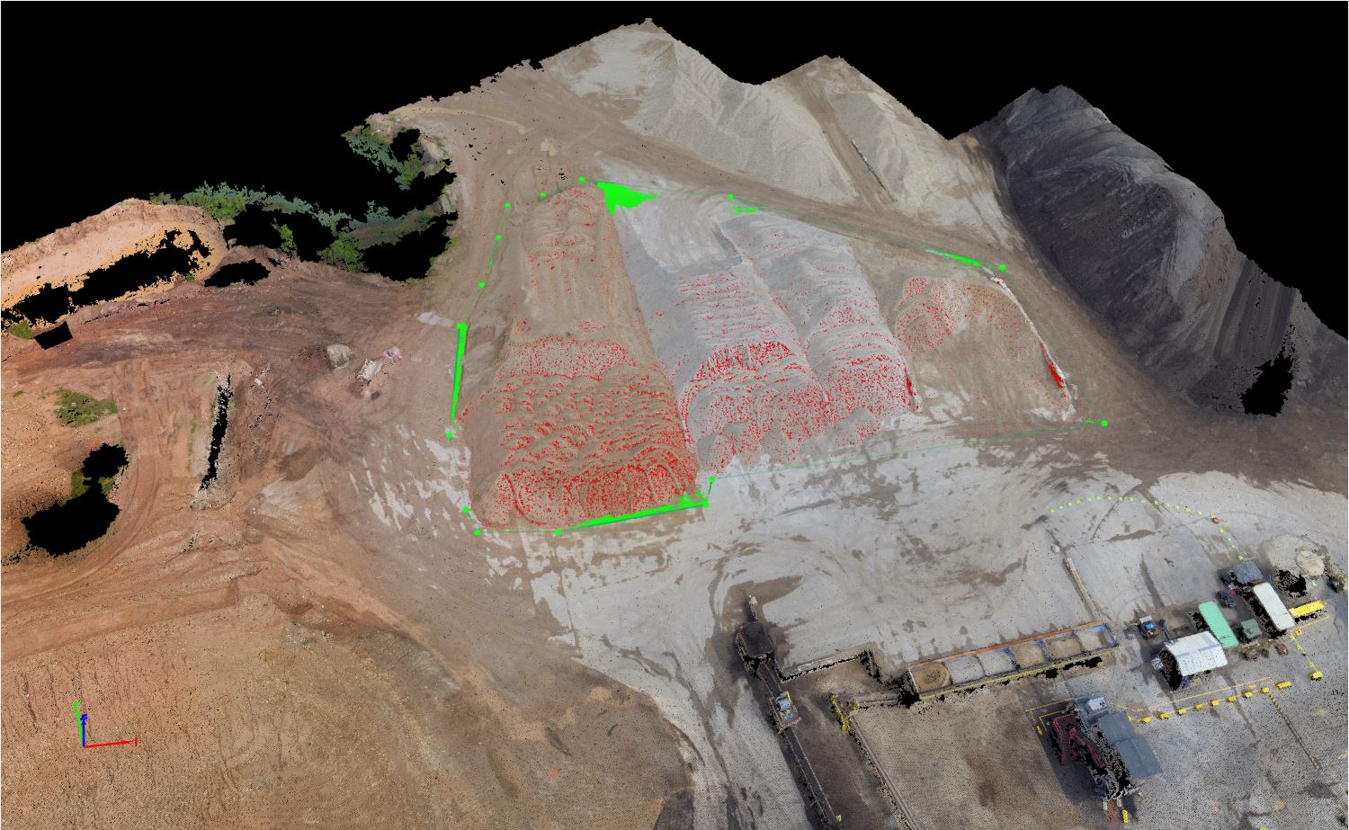
In the third tutorial ArcGIS Pro was used to demonstrate the process through the program itself. The map provided on the website was downloaded into the software, and uploaded as a layer in the project. The layer was called "Hurricane Irma Advisory 29", and the Living Atlas feature within the software was utilized to add "Nursing Homes" as a layer to the project. A new tool "Summarize Within" was used to overlay the polygon of the hurricane's forecast cone and the nursing homes. The final product of this tutorial is displayed in figure 1.

Figure 1


Mapping the Battlefield 
https://learn.arcgis.com/en/paths/mapping-the-battlefield/

Mapping the Battlefield is an 11 hours and 45 minute ArcGIS Pro lesson teaching readers how to utilize the software for military benefit, along with a historic battle story map, and an article on clearing operations with military tools.

Actionable Intelligence, the first lesson in this project, is to "identify the information needed to stop insurgent missile attacks on your base." The data is created by the reader in this lesson, besides the excel file to download, and can be utilized in the readers location as well by inputing their coordinates. The lesson's main idea is to teach the reader how to use historical data and working aids to predict the insurgents intentions. This lesson's plan is to: 1. create a map, and display units to military standards, 2. download the excel file and symbolize the data, 3. convert time format and time zone, 4. apply the spatial analysis with the multiple ring buffer tool, 5. apply temporal analysis. These plans expose more tools to the reader, and displays more capabilities of the software.

Conduct was Clearing with Military Tools for ArcGIS is an article about "removing civilians from areas of interest by visualizing enemy observers' line of sight in 2D and 3D," but it is more of a tutorial that explains the process of how the military tools, that are available for download, can help military leaders make complex and rapid decisions.

Prepare for Search and Rescue Incidents is a 3 hour lesson that demonstrates how ArcGIS Pro can be used to in a rapid way, because search and rescue operators need immediate maps. In this lesson the reader will create a map and configure it with the base and incident data, create an app and configure it with the tools to help the search operation, then use the map created to conduct a search and rescue operation.

Still the Bloodiest Battle in U.S. History is a story map that does not give a lesson on anything but war history in 1918.

Plan a Historic Battle with Military Tools is 2 hours and 30 minutes for the readers to map the coupe de grace Meuse-Argonne offensive to visualize the battlefield decisions made to determine if 26,000 people actually needed to die that day to end the war of wars. With required extensions and tools, the lesson gives the reader time to explore these functions, then the reader goes through a process of drawing symbols and determining all the distances. The final product is a large DSM that the reader can navigate.

Cartographic Creations in ArcGIS Pro is a 2 hour lesson designed to "Make an informative, eye-popping map of Vietnam War bombing missions." More than 1 million missions will be symbolized and displayed within the final product. The lesson plan of this project has the reader add the missions layers, countries layer from the Living Atlas, and time charts. Symbology is then added to all portions of the map to distinguish all the data.

Perform Visibility Analysis to Increase Security is a 45 minute lesson designed to help security personnel plan better with ArcGIS Pro mapping. The lesson plan has the reader determine all lines of sight for the security and the event, then the surrounding area all security can possibly see.

Combating Crime with GIS
https://learn.arcgis.com/en/paths/combating-crime-with-gis/

Combating Crime with GIS consist of six lessons totaling in seven hours of work. This project purpose is to demonstrate how "effective mapping enables law enforcement to detect and defeat crime at its source."

Investigate Prescribed Drugs claims that it can "fight drug abuse by identifying suspicious prescription trends." It demonstrates this as the first lesson in the Combating Crime with GIS project, by creating a workbook to explore and map this data from Washington State, and then analyze reported data from Florida.

Assess Graffiti Incidents in Your Community is a 1 hour lesson that demonstrates to the reader how they can collect all graffiti incidents, and map them to determine if they are worth police involvement. This can also ultimately used to find trends in local graffiti incidents to investigate the person committing this crime.

Track Crime Patterns to Aid Law Enforcement is a 45 minute lesson that demonstrates to the reader how they can help law enforcement with crime investigation, just by displaying patterns within a map.

Analyze Crime Using Statistics and the R-ArcGIS Bridge is a 2 hour lesson much like the previous lesson, but with more advanced applications. After the download of R-Arc GIS Bridge the remainder of the lesson is spent compiling all crimes reported in areas and calculating the areas prone to high crime rates.

Prepare and Present Crime Statistics for a CompStat Meeting is a 2 hour lesson that once again is designed to show the reader how to help law enforcement connect patterns in crime, but with a different application to be downloaded for ArcGIS Pro.

Analyze Credit Card Fraud is a 1 hour lesson that teaches the reader how they can detect credit card fraud, but in this lesson is a company gas credit card. This lesson allows the reader to follow their employees locations, and cross reference it with the amount of money each employee has used.

Estimate Solar Power Potential 
https://learn.arcgis.com/en/projects/estimate-solar-power-potential/

Estimate Solar Power Potential is an hour and 30 minute long lesson that teaches the reader how to calculate the total solar radiation each household rooftop in the neighborhood will receive in a year. Then determine how much electricity each household rooftop will produce if it was equipped with solar panels. The lesson plan for this project starts with the reader familiarizing themself with the geography data and the DSM. Then a raster dataset is created for the solar radiation, covert it to correct units, then they are to be symbolized accordingly. Suitable rooftops are then identified with three sets of criteria. Total power per building is calculated from the suitable rooftops for the final product.

Analyze Fire Preparedness with GeoEnrichment
https://learn.arcgis.com/en/projects/analyze-fire-preparedness-with-geoenrichment/

The Analyze Fire Preparedness with GeoEnrichment lesson is a 30 minute project to "determine the adoption rate for smoke detectors in the forested areas of Marin County, California." This short project determines the amount in percentage of smoke detectors in the forest area of Marion County, allowing the reader to determine the preparedness of this area of interest.

Model Landslide Susceptibility 
https://learn.arcgis.com/en/projects/model-landslide-susceptibility-using-living-atlas-data/

The Model Landslide Susceptibility lesson is 1 hour and 10 minutes to "Locate areas at risk of landslide damage using raster data from ArcGIS Living Atlas of the World." Specifically this lesson deals with data from the Thomas Fire area to determine areas, including major roads, susceptible to landslides. This is due to fact that areas are more susceptible to landslides after wildfires when the vegetation is burned. The lesson plan for this include: 1. locating the appropriate data to input, 2. process the data, 3. a raster function is created to model the landslide susceptibility, 4. find the roads that could possibly experience a landslide from the analyzed raster.


Explore the ArcGIS Living Atlas on your own ArcPro

Introduction


The actual lab work for this week required me to add 5 different layers and create a common connection in a map. In my lab I decided to show a comparison of midwestern Indiana specific airports and poverty. It has been said that majority of the communities near airports are of low economic standings, due to the noise pollution airports create. In this map, this common belief is proven rather true in not only major cities but also smaller cities.

Airports and Runways

The "USA Airports" and "Runways" layers are separate data layers, and are used as the pinpoint locations in the overall comparison of the project. The runways and airports are displayed on the base map shown in figure 2, with the symbology of the different types of airports in figure 3.

Figure 2

Figure 3

USA Poverty Ratio

The "USA Poverty Ratio" raster layer demonstrates the ratios within majority of counties in America. The symbology for this layer is represented by greener areas being lower ratio of poverty, while orange representing higher ratio of low poverty, and grey represents an even distribution. This layer is the base of my argument because without it readers could not tell what area had more poverty in it. For example, in the middle of the picture below, figure 4, is Indianapolis, Indiana. Indianapolis has a major airport, and as shown is surrounded by higher poverty ratio areas.

Figure 4


USA Major Cities

"USA Major Cities" is a supporting layer that displays major cities in the midwestern portion of Indiana. This makes it easier to visualize the airports with each major city in figure 5.

Figure 5


Unemployment in the US

"Unemployed in the US" is another supporting layer that displays the unemployment amount within each zip code of Indiana. It reiterates the poverty trend near airports in Indianapolis and Lafayette.

Figure 6

Final Map

In the "Final Map" all of the layers come together to give a great visualization of the theory of the project. As the reader can see in many places with airports in Indiana, are surrounded by high unemployment and high poverty ratios.


Sunday, February 16, 2020

Lab 4: Processing Data in Pix4D (No GCPs)

Part 2: Get familiar with the product

o What three factors should be considered when designing an image acquisition plan?

The three factors that should be considered when making an image acquisition plan are the type of terrain or object that will be reconstructed, the ground sampling distance (GSD), and the overlap need for the terrain. 

o Type Image Acquisition in the search. What does this article cover?

This article mostly covers the different flight patterns to use when a in the situation for it, but these are talked about to reinforce the main topic of overlap. Overlap is important to fully collect the needed data.

o Type minimum overlap. Then read the ‘how to verify that there is enough overlap between the images’.

§ What is general bare minimum for overlap front and side

The bare minimum for overlap varies on the terrain. In the general case, it is recommended the minimum overlap to be 75% frontal and 60% side overlap.

§ What is it for dense forest? Why do you suppose the increased need?

For forests, or dense areas with vegetation, it is recommended for a minimum 85% frontal and 70% side overlap.

o Type orthomosaic into the search. Then read the article on photo stitching vs. Orthomosaic generation. What is the difference?

The difference between photo stitching and orthomosaic generation are the amount of connections needed, and the dataset capability. Photo stitching requires less than 100 matches to glue together an image, it is recommended for small datasets and flat areas. Orthomosaics require more matches than photo stitching with 1000 matches. These matches however can be used on any terrain, while creating distances that can be used for measurements later. Orthos are used for large datasets as well. 

o Type merge projects. When is merging projects useful?

Merging projects together is useful when image acquisition types are used, and when the dataset is considered large for the capabilities of the available processing resources. 

o What is the difference between a global and linear rolling Shutter?

The difference between a global and linear rolling shutter is that a global captures the picture all in one frame and a rolling shutter captures the picture in a progressive motion. When using rolling shutter on a surface, the final product appears as like a blanket laid over the surface. 

o Are GCPs necessary for Pix4D? When are they highly recommended?

Pix4D does not need GCPs but are highly recommended when accuracy is paramount.

o What is the quality report?

The quality report is the report that displays possible errors and explains the overall quality of the project, as well as how well Pix4D created it. 

Part 3: Use the software

When the analysis finished, many reports proceeded displaying the quality of the data set. The first report of the initial processing displayed the initial quality of the data provided, and whether or not the data will work to create a DSM. If there are caution signs displayed this could be that a couple images are bad and will not calibrate, so to fix this you can enter the menu of the images and remove the ones that will not calibrate. The software then displays a glimpse of what the final DSM will appear as. After the final processing is finished, Pix4D posts more quality reports describing the DSM that has been processed. Details describing the quality of the DSM and orthomosaic final product, Details of the point cloud declassification, and the point cloud mesh quotes (displayed below) are all provided for you in the final report. After the report is read through, and problems have been corrected, Pix4D provides a DSM with missing parts of the surface. This is due to not enough overlap within the data, so those portions did not make the final product. After the orthomosaic was created a 'fly by' video was recorded to demonstrate the contours and features of the Pix4D product. The video is provided in the URL link below. 

https://www.youtube.com/watch?v=w_G-c0cgfN8

Part 4: Maps

o Shaded DSM
Lab #3 Hillshade DSM
Comparing these two DSMs the difference between them, other than the color scheme, is that the one from this lab was created with no GCPs. This is evident with the lowest value for this lab DSM and the one from lab 3 are different. The map used in this lab is the north east corner of the lab 3 map, therefor the lowest value of this map should be greater than or equal to the lowest elevation of the lab 3 map. If the map was created with GCPs the global accuracy would be better increased. 

o Orthomosaic


Part 5: Report

o Introduction: basic overview of software

Pix4D is a software that takes UAS collected data and analysis it for eligibility to stitch together a DSM. This software is important to processing UAS data because it is capable of connecting points and images to create fairly accurate and detailed 3D models of the terrain, wether it be for DSMs, DEMs, or DTMs. For this lab's particular data set, which was provided, there were no GCPs so the DSM did not connect all of the provided images. This caused empty spaces within the DSM, and can be seen in the video. Rolling shutter was used to create the overlap. This caused a blanket like coverage in the DSM terrain, observed from the distortion of the vehicles at the bottom of the DSM. Software like Pix4D is important due to its accuracy for this industry, but depending on the size of the dataset and the settings selected the process can be time consuming. Processing time can be the major portion of the time spent on a project. For lab #4 the processing time can be seen below. 

o Conclusions: final critique.

As was said above, software like Pix4D is important to the UAS geospatial industry. It provides the easiest, one of the cheapest, and most accurate way of collecting and analyzing geospatial data. Pix4D specifically provides a software that is easy to use, and very accurate. It may be one of the fastest processes, but it still takes quite a bit of time. This is a drawback especially if you do not possess a fast enough computer to process the data. Pix4D will bog down the computer so much that it will be hard to do other things with a normal computer. Another drawback is if the data does not provide a sufficient enough overlap, then the whole time collecting the data in the field would have been a waste. Otherwise the software used in this lab seemed to be fairly easy to use, and I am looking forward to use it again.

DSM, Orthomosaic Details
Point Cloud Densification Details

Quality Report

Point Cloud Mesh Results


Sunday, February 9, 2020

Lab 3: Creating a Map With UAS Data in ArcPro

Part 1 (Introduction): 
· Why are proper cartographic skills essential in working with UAS data?
Proper cartographic skills for UAS data allows detrimental data to be collected and displayed properly. 
· What are the fundamentals of turning either a drawing or an aerial image into a map?
Fundamental elements for any drawing or image to be a map are: a title, north arrow, scale bar, locator map, watermark, data sources and appropriate metadata.
· What can spatial patterns of data tell the reader about UAS data? Provide several examples.
Spatial patterns of data are detailed distances of the region collected by the UAS that the reader is able to distinguish what the data represents. An example of spatial patterns would be city density, population density and forestation density. These all display spatial representation, and should have a legend that identifies the difference in the area.
· What are the objectives of the lab?
The objectives of the lab is to teach us all of the possible data that can be produced and how to develop these maps pertaining to the desired map and information. This information can be used in many facets of data collection as explained in the previous question.
Part 2 (Methods):
o What key characteristics should go into folder and file naming conventions
Key characteristics in folder and file naming conventions include careful locating of each file to allow proper sequencing and easy locating, file naming must be descriptive of the material within.
o Why is file management so key in working with UAS data? How does this relate to the metadata?
Good file management is key to UAS data because there can get to be a lot of data taken and analysed which can get lost or confused within the data haystack. This relates to metadata because it is just as important to keep a good track of all metadata information. 
o What key forms of metadata should be associated with every UAS mission
Essential forms of metadata include the pilot’s name, date flown, platform used, sensor used, coordinate system of imagery, and coordinate system of ground control GPS (if used). 
o What basemap did you use? Why?
The basemap used was the given black to white topographic map. This was used because it defines the features of the project area. 
· You built Pyramids and Calculate Statistics for each data set. Enter the descriptive statistics into a table and insert this into your report.
o What is the purpose of these commands
The Pyramid command’s purpose is to provide a better picture when zooming in and out by grouping the pixels together accordingly. The Calculate Statistics command allows the selected data to be analysed to find all elevations.
o Why might knowing Cell Size, Units, Projection, Highest Elevation, Lowest Elevation be important?
This data is important to know because it gives you the information needed to plan accordingly. 
o What is the difference between a DSM and DEM?
The difference between a DSM and a DEM is that a DSM displays all features in the study area such as elevation, trees, vegetation, and other protruding features. A DEM only shows the elevation of the terrain and no other features listed with the DSM. 
o What does hillshading do towards being able to visualize relief and topography.
Hillshading gives the picture shading relative to a certain degree of slope. The features with a higher slope have a darker representation, whereas the less slope features have a lighter representation of color. Figure 1 represents the Hillshade map. 
Figure 1
o How does the orthomosaic relate to what you see in the shaded relief of the DSM
Orthomosaic gives a realistic view of the map by displaying all of the real world features in the area, instead of colors. But the relation between the two allows you to visualize the features along with their relative elevation. This is displayed in Figure 2.
Figure 2
o What benefits does hillshade and 3D view provide? How might this relate to presenting this information to a client/customer?
The hillshade and 3D view provide elevation representation with the shading, along with realistic 3D imaging displaying the physical heights of the features. This relates to presenting this information because it looks more professional along with helping the customers/clients visualize the map easier.
o What color ramp did you use? Why?
The color ramp I used represents lower elevation with a greener shade and moves to yellow then a pinkish with higher elevations. I chose it because I believe it easily represents the difference in elevations.
· You also Generated slope and aspect of the DSM.
o How might these forms of value added data analysis prove useful to various applied situations?
These are useful for people who are concerned with ground movement and strength, either for erosion data collection or ground surveying. This is represented in figures 3 and 4.
Figure 3
Figure 4
Part 3 (Conclusions):
· Summarize what makes UAS data useful as a tool to the cartographer and GIS user
UAS data is useful because not only is it fairly accurate, but it is very fast and easy to capture the data. For a cartographer and GiS user it is useful because it saves time and money, for the most part, and is easily compatible with GIS, allowing an easier process for the users. 
· What limitations does the data have? What should the user know about the data when working with it.
Data has many forms of limitation. The equipment used can have physical limitations or a limit to its capabilities. Also data is sensitive so if it is stored incorrectly or something happened to the transfer process, the data can become corrupted or you can just find out that it wasn’t collected properly.
· Speculate what other forms of data this data could be combined with to make it even more useful.
Other forms of data able to be combined with this data can be future changes to the land or its surroundings. Also the difference in seasons might change the data significantly. To get a better idea of the land itself, saturation levels could be determined and used to help with further planning.